Landing Page Optimization: The What, Why, and How
Pouty bat eyes have the power to make even the deadliest of vampires kneel before them. We don’t play by no fluff, so here’s the proof:

If only sticking pictures of these eyes worked their magic on the people landing on the pages of your website and convinced them to sign up for your product / service. Sigh.
So, landing pages.
Every marketing guru, ninja, expert, and the humble practitioner, will tell you that these pages play an important role in the buyer’s journey. They qualify your visitors into leads and leads into prospects, and eventually customers.
With only one goal in mind, i.e., driving conversions, landing pages provide an offering such as an ebook, free trial, or product purchase, and ask for the visitor/prospect’s information in return.
Although the process looks pretty straightforward, many factors come into play when persuading users to provide their information. You adopt principles and techniques from the conversion rate optimization (CRO) playbook to convince your visitors to become customers.
In this article, we’ll understand how you can implement CRO techniques to landing pages to optimize their performance. We’ll look at the concept of landing page optimization along with a landing page optimization checklist, best practices, and examples.
What Is Landing Page Optimization (LPO)?
Landing page optimization (LPO) is the process of improving various landing page elements to drive more conversions. Rather than relying on gut instinct, landing page optimization takes the following approach:
- Take a peek into the landing page’s performance. Collect data such as the conversion rate, bounce rate, traffic source-wise performance, etc.
- Form a hypothesis based on the data to boost conversions.
- Make the necessary changes to the landing page elements that support the hypothesis.
- Measure the performance.
- Rinse and repeat.
Along with driving more leads and revenue, a well-optimized landing page helps marketers reduce the customer acquisition cost, communicate key information succinctly, and gain valuable insights via page analytics.
The Anatomy of a Landing Page That Converts
Take any high-converting landing page and you’ll find a group of elements built on top of each other that guide the visitor to hand you their information. This group of elements forms the core building blocks of a landing page.
Let’s look at these core building blocks that you can also use as a landing page optimization checklist when designing landing pages.
1. Headline
The headline is this bold, flashy juxtaposition of words that compels the visitors to stick around, read the rest of the content, and eventually take the intended action.
Ideally, the headline should communicate the unique selling proposition (USP) in the form of an idea, the core feature, or the benefit. It’s the incentive they’ll receive for providing their details. Clarity and brevity are super important here because the sooner you address what’s in it for the visitors, the faster the chances of them filling out the form.
Conveying the USP in the headline is important because while 8 out of 10 visitors read the headline, only 2 out of 10 stick around to read the remaining content.
2. Sub-Headline
You can look at the sub-headline as the hype person for the headline. Once the headline grabs the user’s attention, the sub-headline expands on the core messaging. You can write the sub-headline that either complements or supports the main message.
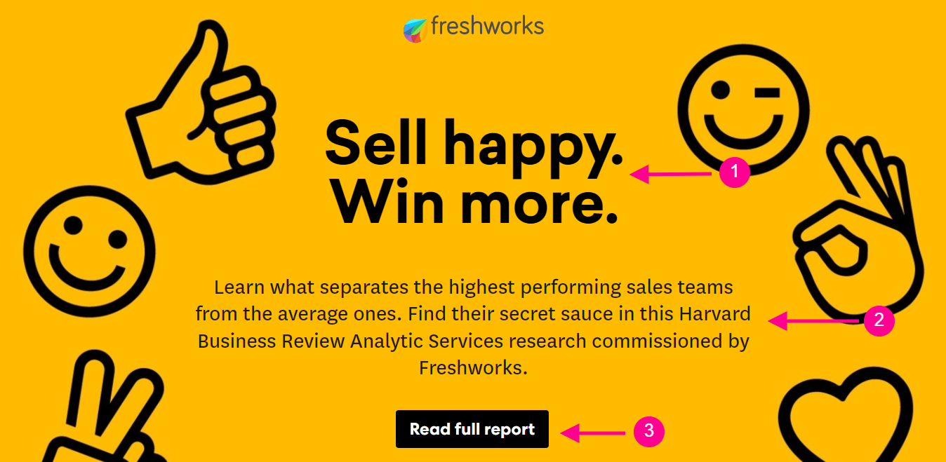
In the above example, you can see the 4-word headline clearly states the what in the form of action and reward. The sub-headline shares the how followed by the call-to-action button.
(In case we didn’t mention, you can build landing pages that pack a punch with Cleverstory like the one above! And no, you don’t need any coding skills to build aesthetic-looking pages.)
Make Content That Is Bingeable And Not Boring
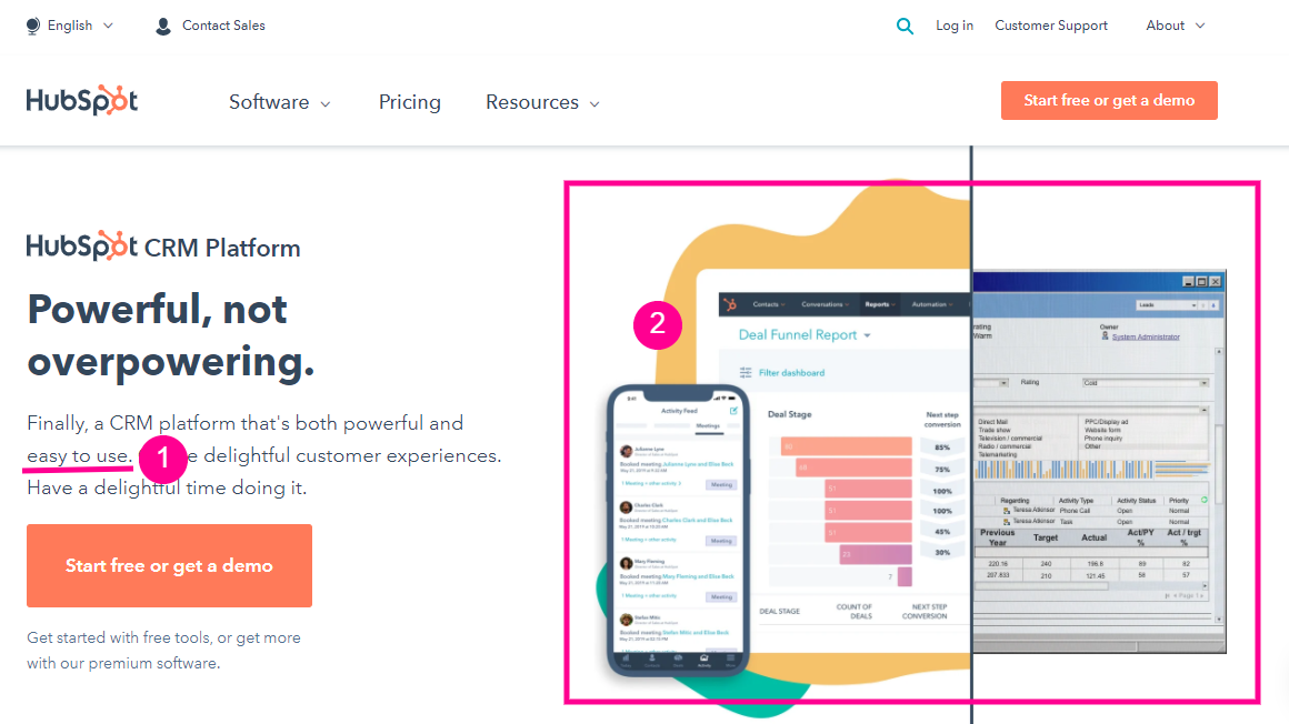
3. Hero Image or Video
The hero image or video acts as a crucial medium to catch visitors’ attention alongside the headline. Ideally, the hero or feature visual should portray your offering in action. It could be an explainer, testimonial, or product demo video.
Embedding videos allows busy folks to get the essential information to make the decision swiftly. According to Wyzowl’s State of Video Marketing 2021 report, 78% of marketers said video has directly helped increase sales. So, visual media is a definite conversion driver.
In the following example, HubSpot uses the hero image to emphasize the easy-to-use and customer experience aspect by showing the transition to the platform-agnostic system from the legacy system.
4. Body Copy
Body copy is where you expand on the landing page’s core message. Structuring the body copy in a modular format makes your content easy to understand.
The most common format high converting landing pages follow is the benefit-feature format. The benefit serves as the headline of each module accompanied by a short, jargon-free feature description. Many landing pages use bullet points to communicate the benefits/features straight out.
You can also include a frequently asked questions (FAQ) section that addresses, well, FAQs.
5. Sign-Up Form
The sign-up form helps you collect the visitor data in exchange for downloads, registrations, leads, or revenue. The information you gather helps you understand more about your audience so it helps collect relevant data points.
Depending on the stage of the buyer’s journey and your industry, these fields can be the name, email address, company, and designation or more granular points like company size, annual revenue, and so on.
The marketing and CRO world is torn between whether to keep the form in the above- or below-the-fold section. While you can experiment to see what works for you, meantime, you can add a button in the above-the-fold section that takes super-enthusiastic visitors directly to the sign-up form.
6. Call-to-Action Button (CTA)
The CTA button can appear below the sign-up form or as a standalone element that takes visitors to a different page when clicked on. The CTA button is the most crucial element on the landing page and, therefore, should stand out without being abrasive.
The copy on the CTA button instructs the visitor the action they need to take or the benefit they’ll receive. For example, for an ebook download, the CTA can state Click to Download the PDF Copy (Action) or Receive Your Free Copy (Benefit).
Let’s look at how Slack combines the best practices for body copy, sign-up form, and the CTA button.
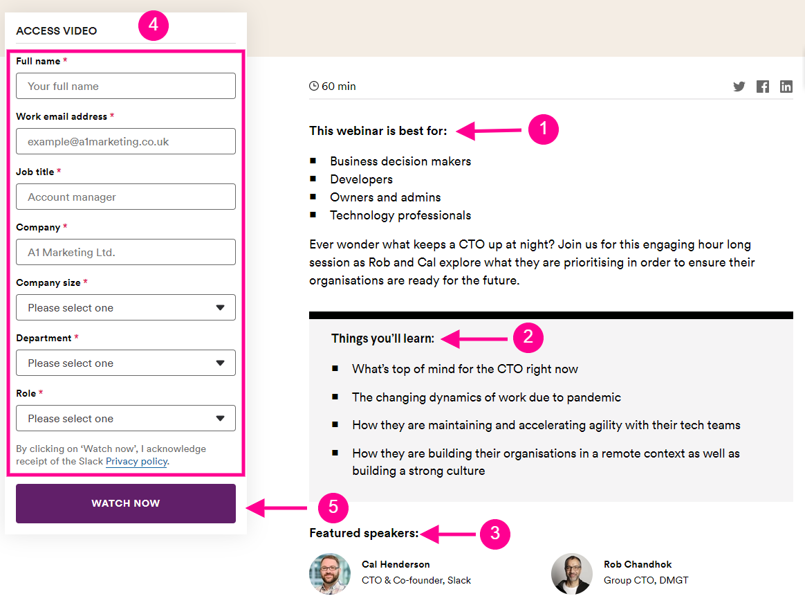
- Firstly, the body copy qualifies the visitor by mentioning the ideal target audience for the webinar, followed by the key takeaways and speakers.
- The sign-up form collects the professional information of the visitor, which can help Slack run targeted campaigns based on the company size, department, and role.
- The CTA button sells the promise/incentive Watch Now, which provides instant gratification to the visitor.
7. Social Proof
Social proof establishes the credibility of your offerings. While the other elements capture the attention of your visitors, what’ll compel them to click on the CTA button is the votes of trust from real people, ideally people who are similar to them.
Showcasing product reviews, customer testimonials, case studies, and clientele help you dissolve any potential hesitations a visitor might have before signing up.
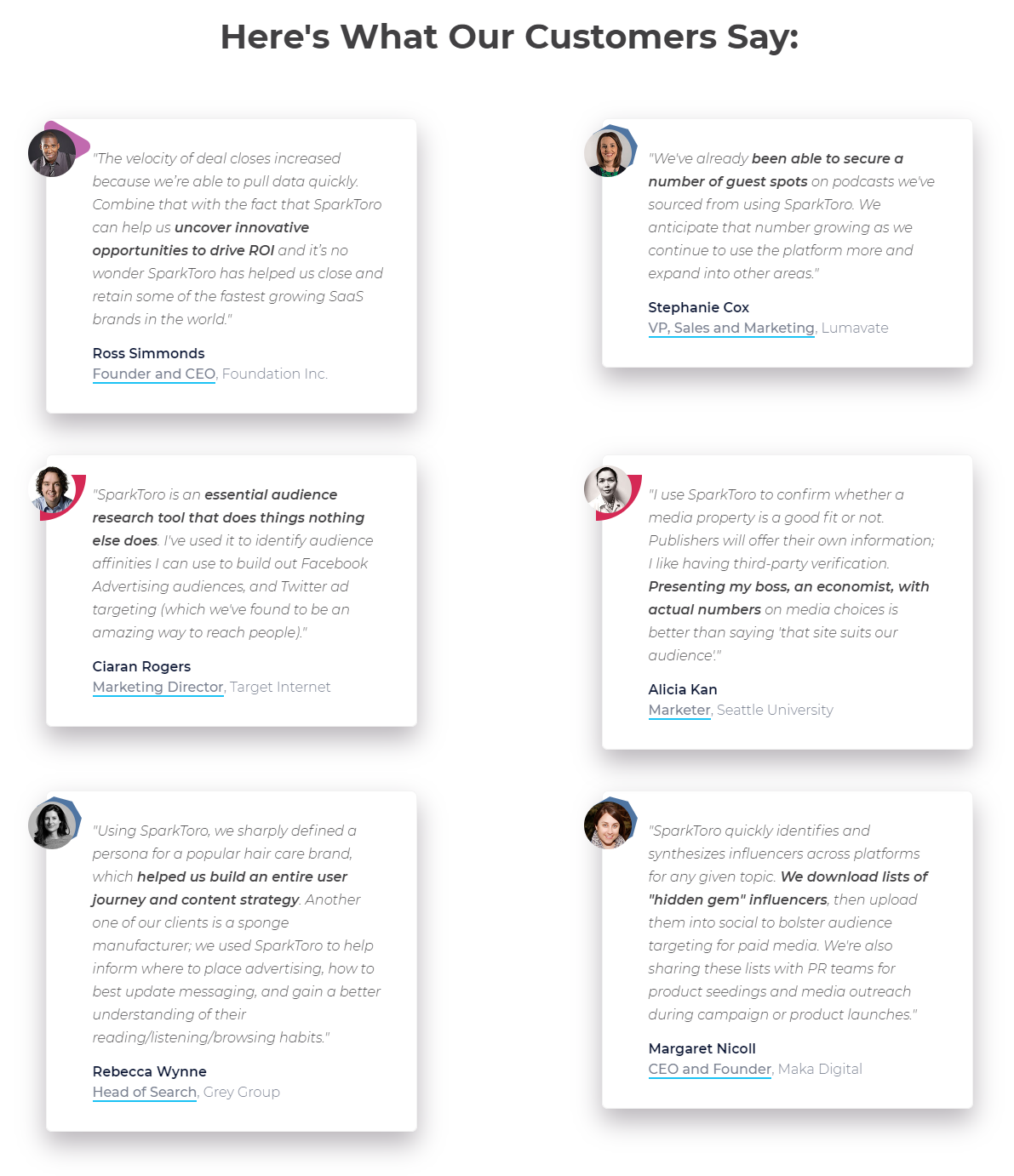
Sparktoro’s homepage acts as its landing page in many ways. The homepage features customer testimonials to establish credibility. Each testimonial highlights certain phrases that focus on the key pain points Sparktoro addresses.
8. Scarcity Tactics
The term scarcity tactics may sound like needing you to place some guileful content on the landing page, but it’s anything but that. If we don our social psychology hats for a moment, we see that people place a high value on things that are difficult to obtain.
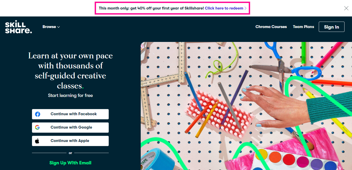
Scarcity tactics like introductory pricing, seasonal discounts, limited seats, or limited product availability persuade users to take action faster due to the fear of missing out. For example, Skillshare promotes its limited period discount right at the top of its landing page.
9. Footer
The footer on your landing pages doesn’t need to be as comprehensive as the website’s footer. Keep only essential links such as the terms of service, privacy policy, trust indicators/security badges, GDPR compliance details, and copyright information.
Here are a few landing page templates for inspiration.
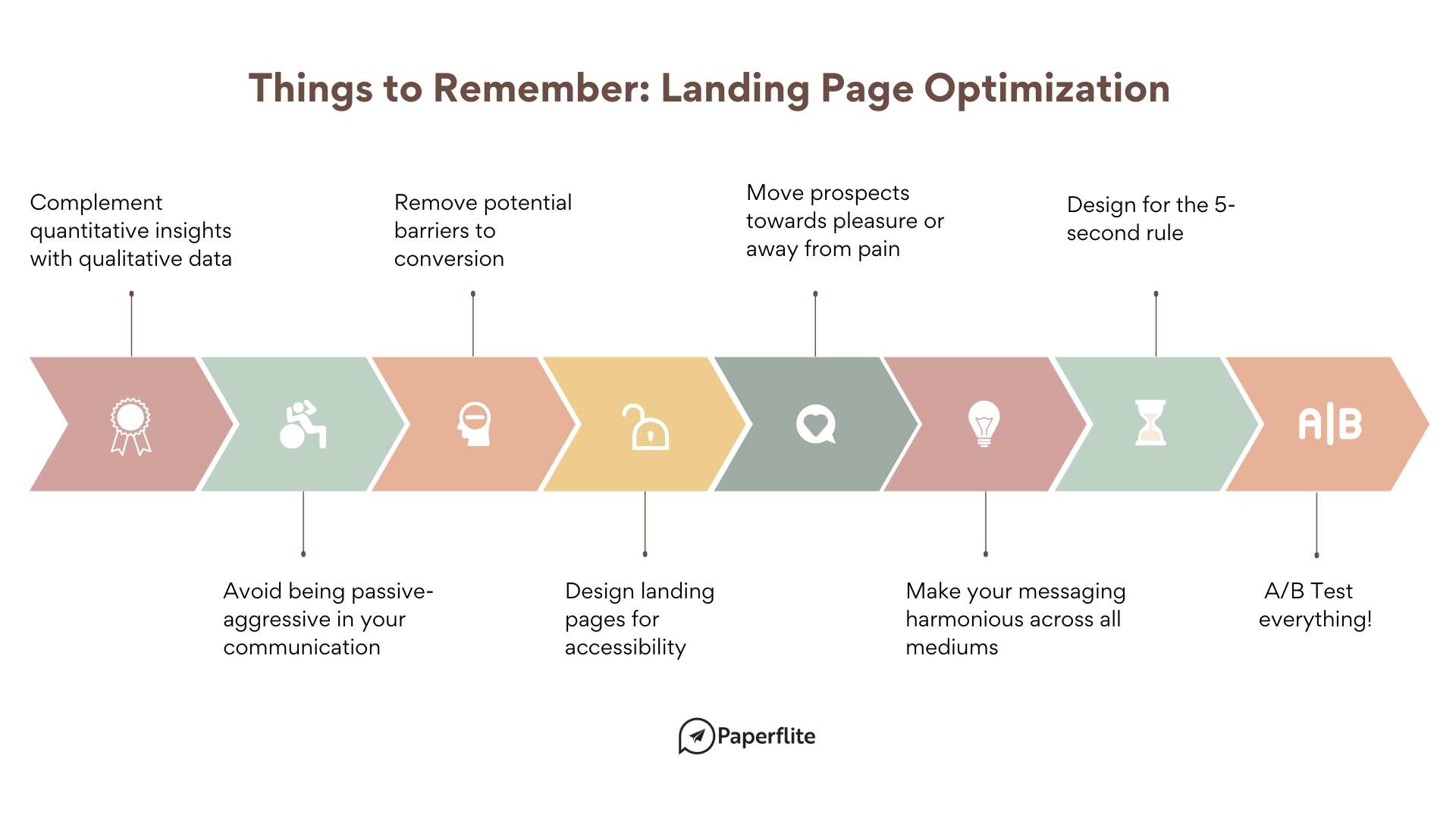
8 Landing Page Conversion Optimization Best Practices
Contrary to popular belief, a well-optimized landing page isn’t only about aesthetics. Design is critical, but it comes after understanding your target audience. Study the relevant buyer persona(s) and use their demographics, psychographics, goals, challenges, and product use cases to craft the ideal messaging and make the right design choices.
Here are 8 landing page optimization tips to bring home more conversions:
1. Complement Your Quantitative Insights with Qualitative Data
Quantitative analytics combine metrics such as visits, bounce rate, conversion, average time spent with dimensions like city, languages, visitor types, etc., to present information, which is mostly just numbers. While you can also visualize the conversion funnel through quantitative analytics, it doesn’t fully uncover user behavior.
Integrating qualitative information with the help of heatmaps, session recordings, and form analytics lets you get into the nitty-gritty of how visitors navigate the page. You can track mouse movements, clicks, pauses, hesitations, and interaction time which are more actionable indicators that let you optimize the conversion rate of your landing pages.
You can implement conversion rate optimization (CRO) tools like VWO, Optimizely, Hotjar, and Qualaroo.
2. Avoid Being Passive-Aggressive In Your Communication
Nobody likes someone who has this nagging need to show their expertise. They do it by throwing jargon or making snide remarks in the middle of a conversation.
We thought you knew. It’s alright if you didn’t, though.
There is a high chance you might have come across messaging on landing pages or pop-up boxes that rely on passive-aggressive messaging in the hopes of coercing visitors to take the desired action. You might find brands using such messaging combined with scarcity tactics to promote discounts or limited-period offerings.
On using passive-aggressive messaging in marketing communication, HubSpot’s managing editor, Corey Wainwright says, “The problem with these lines is they put words in the consumer's mouth. Either way, they're probably wrong. If I like the business, I'll probably want to save more money with them. If I don't, or I don't use them enough to even want the savings -- it's just weird. In the end, a simple “No thanks” or a “Nah, I'm good” for a more colloquial brand would do the trick just fine.”
3. Remove Potential Barriers to Conversion
The qualitative tool gives you plenty of insights on improving conversions. In the process, you’ll also identify the hurdles that either delay the conversion or cause a drop-off. Here are three effective ways that can reduce friction.
Answer All Possible Objections
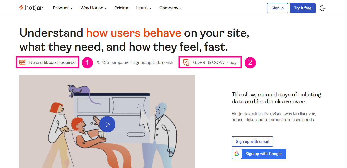
People tend to hesitate when signing up for a free trial if the form asks for their credit card details. Hotjar addresses this reservation on their homepage, right upfront, along with GDPR compliance assurance, which is a key requirement when collecting buyer data.
Simplify the Form Filling Process
Determine the number of form fields by keeping the stage of the buyer's journey in mind. Remove any field that is not relevant during that stage or can be requested during onboarding. Omnisend's research vets for this recommendation - in their research, the signup rate dropped below 1.5% when asked for more personal questions like the phone number or gender.
After optimizing the form, you can implement features like smart gating that autofill prospects' information removing any friction.
P. Sst.: The smart gating feature comes built-in with Cleverstory. So, if you are looking for a no-code tool to build interactive landing pages, give us a holler!
Don’t Make Your Prospects Doomscroll
Doomscrolling is a good practice for social media platforms or for boosting the average time spent on the website. But when optimizing for conversions, you want the prospect to convert as swiftly as possible.
Making them doomscroll just to find the CTA button like the following example is not only inconvenient but also creates friction and delays the process.
Instead, you can place the content in a modular fashion to make it more readable. When you click on the CTA button from the above screenshot, you are taken to another post-click landing page which is modular and makes the form filling process simple.
4. Design Your Landing Pages for Accessibility
Following web accessibility standards allows you to design pages that are accessible (can understand and interact with and contribute to the web) to people with disabilities. And optimizing your site for accessibility is not simply an exercise in improving user experience but a legal requirement.
Here is a crash course in making your landing pages more accessible:
1. Optimize Content for Screen Readers: Even if you can’t place your content in a linear fashion for screen readers, place it in the right order. This means following the right hierarchy for heading tags (h1, h2, h3, etc.) and text content so that the screen reader interprets it correctly. Avoid using heading tags purely for stylistic purposes.
2. Provide Substitute Text for Non-Text Content: Provide alt text, description, and captions for images and videos. Briefly describe the content from charts, diagrams, and infographics. Provide accurate labels and placeholders for form controls, buttons, and other interactive content and elements.
3. Use Colors and Motions Mindfully: Motions such as the parallax effects, flashes, and animations can cause seizures and other physical discomforts. Maintain an appropriate color contrast ratio for different types of text and content.
5. Move Prospects Towards Pleasure Or Away From Pain
People buy products, consume content, or do anything, in general, either to move away from pain or towards pleasure. But research suggests moving away from pain seems to be a stronger motivation.
Marcus Sheridan ran an experiment where he addressed the obvious fears, worries, reservations, and anxieties of prospective buyers on the landing page. The result? The form conversion rate saw a whopping 80% rise!
6. Make Your Messaging Harmonious Across All Mediums
According to Salesforce, it takes 6-8 marketing touches to generate a sales-ready lead. When promoting a campaign, you need to have a unique element across every platform and medium to establish a recall in your buyer’s mind. This unique element could be a visual, a tagline, or a sound that’ll make the buyer relate it to your brand.
This means whether you are using email marketing or paid ads to promote your landing page, use the campaign’s unique theme across every marketing touchpoint. So, when the buyer is on the landing page, they are already aware of who you are or what you are offering.
In the following example, Inoreader uses the same graphic and tagline in the email and on the pricing/landing page to reinforce the offering.
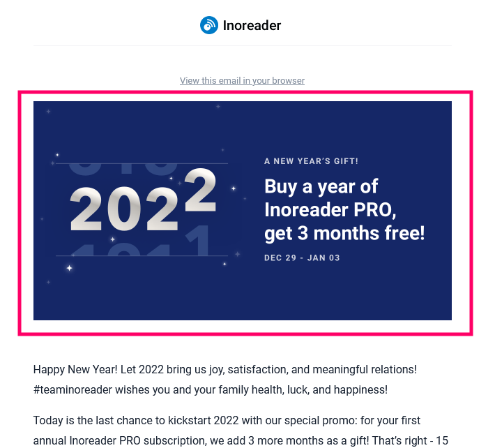
Image: Inoreader Email Campaign
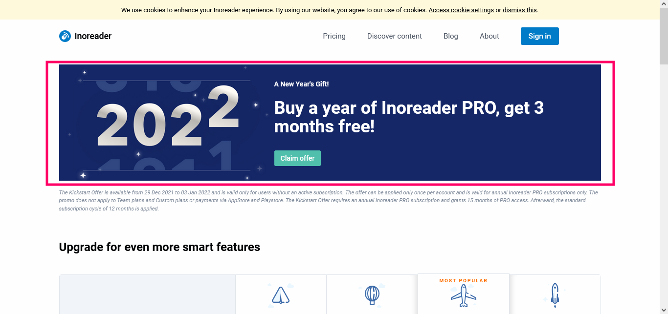
Image: Inoreader Pricing/Landing Page
7. Design Your Landing Page for the 5-Second Rule
Before Mel Robbins talked about the 5-second rule to beat procrastination in her 2011 TED Talk, Oli Gardner of Unbounce used it to analyze landing pages. In a blog post dating more than a decade back, Oli says, “If a visitor to your landing page can’t figure out what you’re offering during the first 5 seconds, you’ve probably lost them. There’s simply too much to do online these days.”
Not much hasn’t changed since then, except there’s way too much to do online today. Therefore, keep in mind the 5-second rule when designing the landing page. To do so, highlight the USP, key benefits, and if possible, CTA in the above-the-fold region.
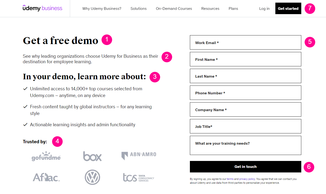
Udemy Business’s landing page does a great job at this. Just by having a glance at it, you can note that it is asking users to sign up for a demo. It also stacks the essential landing page components in a hierarchy that goes over the features, major clients (social proof), and a sign-up form, and the CTA button.
8. A/B Test Everything!
If we would like you to take one actionable takeaway, it would be this: Test everything. When you are designing a landing page, you’ll inadvertently run into questions like:
- Should I use a promo or an explainer video?
- What should the color of the CTA button be?
- Should I keep or remove the navigation bar?
- Can I just delete all form fields and ask for name, email, and phone number?
- We can just go on and on.
Coupled these questions with conversion rate optimization tips like using contrasting colors, exit intent pop-ups, a specific hex color code for the CTA button, you’ll have more questions than answers. But that’s okay because you already may have qualitative insights at hand, so you know what works. If not, begin with industry benchmarks.
Now, pick a pivotal element and form a hypothesis around it that you expect would work. For example, if people are signing-up without hesitation, you hypothesize that you’ll add two more form fields to see the impact. You now create two versions of the landing page - the default, high-performing one (the control page) and the one with additional form fields (the variation page). Now, you direct the same number of traffic to both pages and wait for the results.
If the variation page brings in an equal number of conversions, you count it as a success. You integrate it in your main landing page and move to the next test else, you go back to the drawing board.
You keep iterating through this process until you have solid, actionable insights that you can implement at scale.
Closing Thoughts
Phew! That was a lot of information to read and process. We hope the article has helped you understand what it takes to build a high-converting landing page. However, CRO for landing pages is a continuous process. Once you implement the ideas from this article, keep tweaking them through A/B tests to maximize the results.
Before we conclude, if we are to share the gist of landing page optimization, we can sum it up as follows:
- Identify what drives and motivates the target audience and address them on the landing page.
- Identify potential obstacles and barriers that keep visitors from taking action and remove them.